mini.css is one of the lightest front-end frameworks on the web: about 5KB gzipped. This helps your websites load faster, while still looking great!
mini.css is built in such a way that it will look great on most devices and especially phones and tablets. This allows you to easily tailor your websites to different users!
mini.css gives you the power of customization, using its fully moddable flavors. This will give you control over how your websites look and allow great designs to stand out!
Below you can see a showcase of the features and styles included in the default flavor of mini.css.
This is a paragraph with some sample text. Did you know mini.css v2.0 is codenamed Fermion? No? Well, now you do! Maybe you want to know what our inline elements look like. For example a link to the Github repository of mini.css looks like that! Neat, right? Maybe you want to see some inline code or some sample input. Oh, also small text is cool, along with its siblings: the subscripthi! and the superscripthello!. We use highlights quite a lot as well. Apart from the primary color, you can also try the secondary and tertiary colors. If you wanna be fancy, maybe use a tag or a bubble. All of these work well inside headings and the like. To finish our typography tour, check out the preformatted code block below.
function sum(num1, num2) {
    var num3 = num1 + num2;
    console.log('Result: ' + num3);
}
mini.css uses the Flexible Layout Module (commonly known as flexbox) to create a grid system for easy page layout. The grid system is not the most feature-rich one, but it contains all the essential components. The container of the grid is fluid by default, meaning it will adjust to fill its parent container. Rows are easily created using the row class and columns can be created using the usual col-SZ-XX syntax where SZ and XX are replaced by a screen size and a number of vertical columns respectively. Columns can also scale themselves automatically if you omit the number of vertical columns in the class name. Similarly, you can use offsets with the col-SZ-offset-XX syntax. The default grid is separated into 12 vertical columns. You can see some examples below.
mini.css adds modern styles for many of the HTML elements.
Tables are responsive and use the data-label attribute to specify the header name for each cell, so that they can be displayed as cards on mobile devices. Here's an example (resize to see mobile display if you are on desktop):
| Name | Surname | Handle | |
|---|---|---|---|
| John | Smith | johnsmith@mail.com | SmithereensJohn |
| Lisa | Cody | codyl@mail.com | Codyl |
| Max | Roberts | terminus@mail.com | T3rm1nu5 |
| Adam | Leeks | leekt@mail.com | Leekt |
Forms are inline by default and textual <input>, <textarea> and <select> elements have been pre-styled. To make inputs take up more space than their default, simply add something like width="100%". You can also utilize the grid system to align forms to your liking. Below are some examples:
Use the <header>, <nav> and <footer> elements to add navigational elements to your page. The <header> element displays as a non-fixed horizontal bar and can contain a logo along with a set of links or buttons. Style any links using the .button class to give them the proper style. it is suggested that you place the <header> element outside of your grid system's .container to avoid styling problems. You can see an example below:
<nav> implements the traditional navigation sidebar, using simple styling. The sidebar is not fixed by default and it has no specific width set, so you can use the grid system or some Javascript code to show or hide it and decide its size. Use simple links and <span> elements to add links and categories. The .sublink-1 and .sublink-2 classes can be added to create links in categories and subcategories. Below you can see an example (sidebar is displayed next to text on medium-large displays, but fills the whole display on phones and smaller screens):
This is some sample content that will show next to the navigation menu. Which means that we'll have to present some more fun facts about mini.css to occupy this space. Well, here's a couple:
Finally, use the <footer> element to create your footer. Add links, images, credits. This element is not meant for main navigation, but many pages use it for some kind of navigation or other. Try to place the <footer> outside of the grid system for best results. Below is an example:
Buttons are already pre-styled in mini.css to allow for consistent presentation. However, there is a lot you can do to customize them, as the pre-applied styles are mostly overrides for the default presentation styles. Pre-styled buttons and other button-like inputs can be seen below:
Link buttonFile inputs are a sore spot in most frameworks, as they cannot be easily stylized using CSS. mini.css deals with the problem, using a workaround involving labels that use the button class, which applies the exact same style to those labels. Just link it to the <input type="file"> element of your choice and you're good to go. For example:
There are also different kinds of buttons, specifically primary, secondary and tertiary, as well as small and large buttons. All of these types can be specified as classes. For example:
Checkboxes and radio buttons are styled using the checkbox hack, while keeping things simple and adding just the needed consistency for those input types. Place an <input> (checkbox or radio button) and a linked <label> inside an .input-group and the controls will style themselves. To allow accessibility for those controls, you can use tabindex="0" on the <input> elements only. You can see some examples below:
The <progress> element is used for progress bars. There are three color variants (default, secondary and tertiary), as well as an inline class that displays the progress bar as an inline block, along with a nano variant for tiny progress bars. Below are some examples:
Inline progress:
Nano progress:
The utilities provided with mini.css aim to solve common problems and allow ease of use whenever possible. Some of them are showcased below:
Generic border (using black outline and opacity of 0.25), Radial border style 1 & 2 .
You can also use the .hidden class to hide any element you want or the .visually-hidden class for elements that need to be invisible to users but exist in the accessibility tree, set floats to left or right using the .float-left and .float-right classes or clear floats using the .clearfix class, which implements the micro clearfix by Nicolas Gallagher. Finally, use the .center-block class to make an element center and display as a block.
Cards are some of the most modern and stylish content containers and are widely used in many website types. mini.css provides you with the .card class, along with a handful of pre-built styles to help you create beatiful cards for your pages. Note that this module is heavily dependent on the grid system module. To use the cards, simply replace the grid's columns with your cards and you're ready to go. Below are some examples:
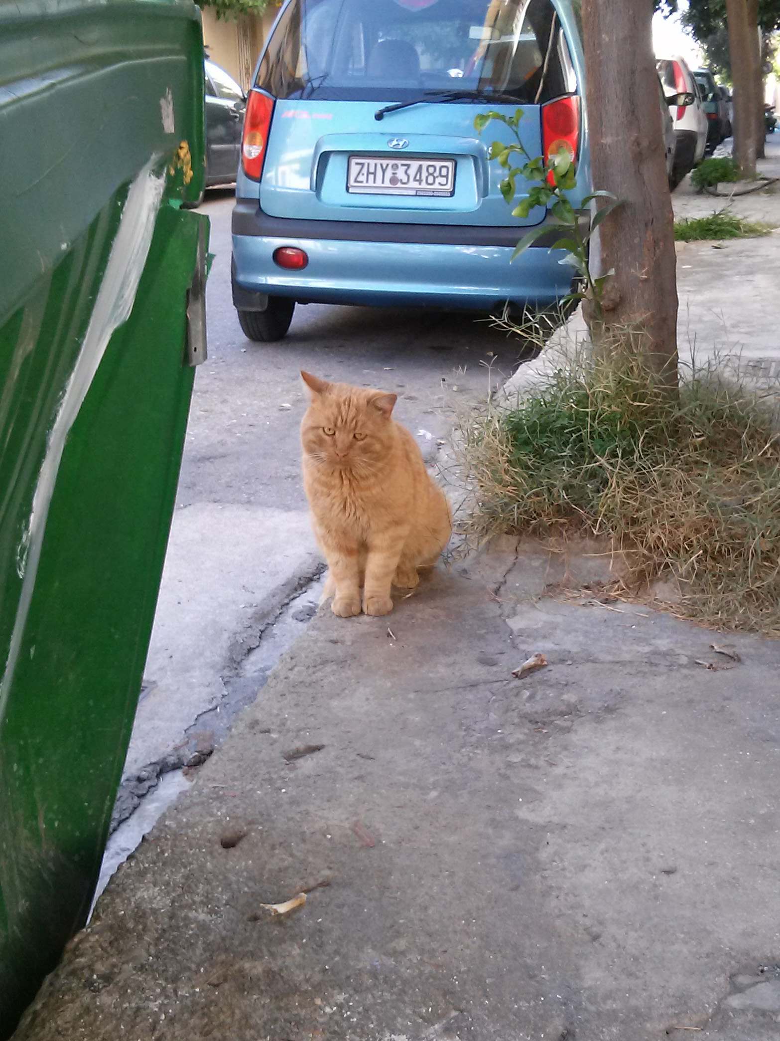
This cat is pretty amazing, right? Just look at it!
Cards are pretty awesome, as you can see.
This is a card with three text sections.
By the way, here's a link to the mini.css project repository on Github, just in case.
<button>s and other similar elements as card sections. Like the button below.Cards resize automatically to fit any and all content, allowing you to do anything you want with them. They also align the content automatically, so your sections will always look pretty. Nothing to worry about anymore!
.dark headingTotally normal text.
.primary section text.
There are also .small cards. Tiny, cute, small cards.
And, of course, there are .large cards.
Because you'll need them.